
SiegeGG Case Study
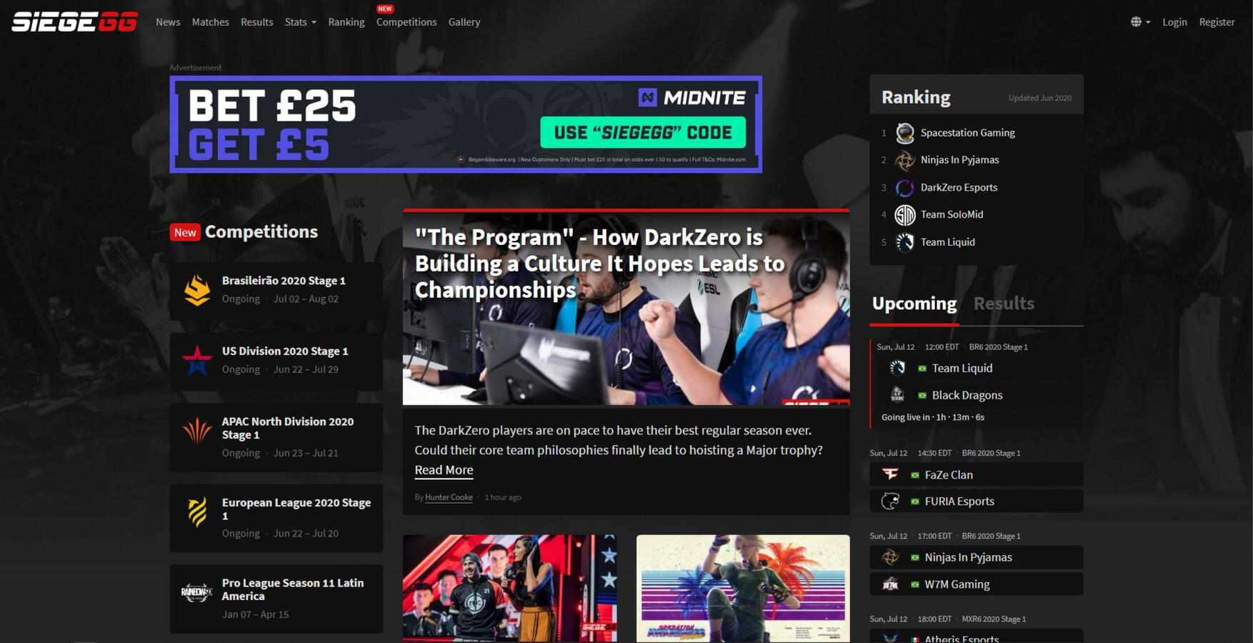
SiegeGG is the leading website for Tom Clancy’s Rainbow Six: Siege esports statistics, analysis, news, and match information. This conceptual redesign is to restructure the website's content, which in turn will ease usability when searching and displaying player stats, match info, and news.
Problem
Fans of Tom Clancy’s Rainbow Six: Siege esports are having difficulty when navigating statistics and match information or not finding their desired results. Rainbow Six esports has a large number of leagues and players, which can cause more hassle when searching for stats.How can we create a solution that will provide SiegeGG users with an improved architectural experience while also providing more league, player, match info?
Constraints
Given this was a complete redesign, there was minimal limitation on creative solutions. The major constraint to the project was a lack of a direct API to Rainbow Six: Siege, which limits certain aspects of a match to be recorded.
Project Scope
- Streamline search data
- Create seamless easy to view experience for R6 esports fans to browse match, player, or map statistics
- Learn what statistical areas of competitive gameplay are important to R6 esports fans
Design Objectives
- Improve the browsing experience for R6 esports fans searching for league, event, and player statistics
- Improve match, player, and map statistics discoverability
- Create easy to use top navigation and statistic filters
My Role
User Research | UX Designer | UX Architect
Methodologies
User Survey, User Personas, Multivariate Testing, Competitive Analysis, Sketching, Wireframes, Prototyping
Tools
Pencil and paper, Flowmapp, Invision App, Adobe XD
Research/Analysis
I conducted a competitive analysis of similar websites and mobile applications which record and track large amounts of statistical data such as NBA, HLTV, Liquipedia, Juked.gg, and Premier League. After studying these platforms, the conclusion of the redesign solution was to rework the information architecture to present the content in an easily digestible format.
This design is for...
Before conducting the user research, an assumption was made as to who the targeted user group would be and how they would use the platform. After conducting the user research, some assumptions were reinforced about the invested target group but also provided clarity as to how a casual target group would utilize the platform. This meant the platform had to be simple and engaging to not deter new users while also providing depth and substance to satisfy heavily invested users.
Personas


User Testing
What users thought before...“There’s plenty of stats and articles but it's not organized well, so finding info can be difficult.”“I know exactly what I’m looking for but it takes too long to find, due to lack of a search function.”“I want to see operator and map stats but there are none listed.”
What users thought after..."I think the new site looks really good. There is so much potential for this site and I'm looking forward to seeing how the redesign continues to develop new features. ""The redesign looks solid. The restructure and addition of a search bar, makes finding stats and articles easier.""I appreciate the addition of operator and map stats to match previews, match results, and player profiles."
User Flows


Competitive Analysis


Wireframes


Prototype


Future Considerations
As the Rainbow Six: Siege API becomes less restrictive, it will allow for improved, as well as new, features to be developed. This would also provide a stable basis for a standalone mobile app, which would be the next major focus of development.